
Notes on the data for the charts comparing professors to the public
The data from the charts here were pulled from my forthcoming book. Below are some notes on the data, cribbed from the endnotes of the book.
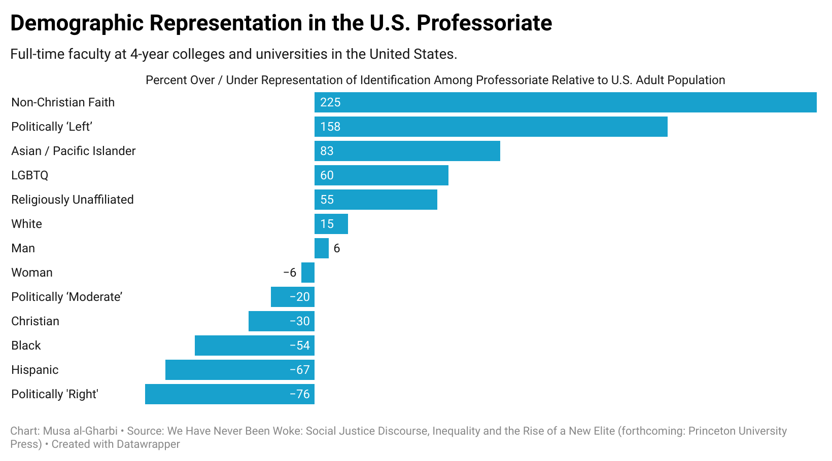
- Data on the gender, racial, and ethnic composition of U.S. faculty are derived from NCES estimates of 2021 employees, the latest year available at time of writing. To ensure apples-to-apples comparisons, estimates of the demographic characteristics of the broader U.S. public are derived from same-year NCES estimates.
- Data on the sexual orientation of faculty members are provided by the Higher Education Research Institute, looking at faculty from the 2016–2017 academic year (the latest HERI faculty survey report published at time of writing). Estimates of the sexual orientations of U.S. adults more broadly derived from same-year estimates by Gallup.
- Data on the political leanings of faculty are from 2019 HERI data, presented in Oswal 2021, table 1.Estimates of baseline political identifications among U.S. adults based on same-year estimates by Gallup.
- The most reliable source for religious identification of U.S. faculty was from Gross & Simmons 2009. Estimates for the broader population were derived from the same-year American Religious Identification Survey. Critically, as discussed in We Have Never Been Woke (the book these charts are derived from), the kinds of people who become college professors have secularized over the last decade at a far higher rate than the general public (more on this point here too). As a consequence, this table is likely to significantly underestimate the current religious gaps between professors and the U.S. public.